

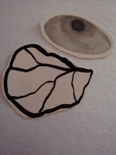
 It can sometimes be tricky to get the right colour and ink intensity in a print. I've played around with this print quite a bit over the last few days. A few posts ago I said I wanted it to have soft, gentle colours but now I'm not sure. The pale ones were ok but now I think I prefer the more intense blue colour in the later print run. I still like the composition and use of shadow in the print, but I think I might keep playing with the background colour a bit more before I let it just rest for a while. It's amazing how your attitude towards a print can change if you just walk away from it for a few weeks.

:) It is quite amazing isn't it, how you might just adore something you've made, and then a day, week, two weeks later, wonder if you were on drugs, or not enough drugs for that matter. LOL.
ReplyDeleteI think artist have to work within the reality that we all end up going through love hate relationships with our work - or if not love and hate, "like it" and "hmmmm, must change that bit"
It's never ending for me, so I can totally relate. :)
a very interesting information, with this insight we are getting, thanks a lot for various information
ReplyDeletepengobatan untuk sembuhkan tipes pada anak,pengobatan untuk sembuhkan stroke ringan,pengobatan untuk sembuhkan gondok beracun,obat pereda sinusitis tradisional,obat penghilang kista coklat tradisional,obat penghilang polip hidung tradisional,obat penghilang gondongan tradisional,obat penghilang lipoma tradisional,obat pereda batuk berdahak tradisional,cara mengatasi penyakit ispa pada anak,obat pereda nyeri rematik tradisional,obat pereda nyeri ulu hati tradisional,cara mencegah dan mengatasi bunion,obat pereda demam tinggi tradisional,obat pelebur batu empedu tradisional,cara mengobati bab berdarah dan berlendir,pengobatan tradisional kista medullary,obat pereda nyeri otot dan sendi,pengobatan tradisional hemofilia,cara mengobati luka bakar melepuh,obat infeksi mulut tradisional (kandidiasis oral),cara mengobati ulkus peptikum,pengobatan tradisional peranakan turunan,cara mengobati sindrom iritasi usus,pengobatan tradisional untuk penyakit ayan,cara cepat meredakan nyeri ulu hati,cara mengobati emboli paru,pengobatan gusi bengkaka dan bernanah,cara mengobati tonsilitis kronis,cara mengobati laringitis kronis,cara meredakan maag kambuh,obat stroke hemoragik tradisional,cara menyembuhkan radang panggul,cara mengatasi pegal di leher dan pundak,obat pengahancur lemak jahat,cara cepat menghilangkan tumit pecah-pecah,