Sunday 24 January 2010
black & white
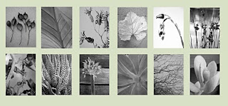
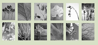
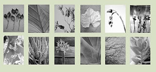
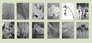
I need your help. I'm putting together a composition of my black & white photos to frame and place above our bed. I've made these 4 mock ups in photoshop (got to love photoshop for these little jobs :) to help me get an idea of what might work where. The idea is they'll be framed in frame-less glass frames. Our bedroom wall colour is approximately the colour of background pale green behind the photos. My question is do you have a preference for any particular composition? And if so why? Click on the image to see it much closer.
Subscribe to:
Post Comments (Atom)




It's hard to say from a computer monitor. Have you tried printing up roughs and taping them in over your bed? That's what I'd do.
ReplyDeleteHi Meagan - yes I started with paper and then wanted to see how the whole series would work so did these 4 mock ups. I'll print them all out eventually though.
ReplyDeleteI like no. 1 - it seems a stronger, more balanced grouping however, I agree with Meagan's suggestion. Nothing like seeing it in situ. Good luck!
ReplyDeletecomposition 3, first impression!
ReplyDeletethey are all such gorgeous photographs!!! awesome!
Really hard to say but I'm gonna go with #4 or #1.
ReplyDeleteNumber 1. I like this one because there is the most contrast in design between the top and the bottom of each panel.
ReplyDeleteSusie
And thanks for your Poppie vote, very sweet of you :-)
all beautiful! but i'd go for no.3 because the light seems more spread out so there is an overall feeling of peace rather than a patch on. does it make sense? anyway, all lovely. have a nice week. kenza
ReplyDeleteNo.1. Want to know why? Your optimal entry point (top left) and your terminal anchor (bottom right) have a balanced amount of dark and light and so balance the set. I layout newspages for a living. I see these things and make these decisions to a deadline every day. Oh, that and gut instinct.
ReplyDeleteThat's so interesting Kate! No 1 is the one we've both been gravitating towards. Now I know why in official newspaper layout terms :) It just feels good to me.
ReplyDeletehelloooooo there! I like no# 3 Kylie. I think the balance, and space in this appeals mostly. By that I mean, the shades and hues are not too dominant, and there's a flow in the work. However, they are all really nice groupings, and whichever you go with will look great. But yeah, something about number 3 does it for me a little bit more. Sorry I haven't made much sense. xo
ReplyDeleteThat explains why I went for No 1 as well - I liked the balance. Really lovely photos by the way .. Vicki
ReplyDeletemaybe throwing a cat among the pigeons here - is that the right phrase? - but i'm wondering whether newspaper layout rules are entirely appropriate for a piece of art hanging on a wall. They are all beautifully balanced to my mind and i think gut instinct rules the day.
ReplyDeleteAlso, the 2nd last image (moving left to right) in the top row appears to have a much lighter background than the other photos and this was the first thing I noticed. Really stands out to me and breaks the unity a little. But as these are mock-ups you're probably aware of that and I'm just coming across as pedantic and a little annoying. No intention to annoy. As I said, cat, pigeons, whatever. Individual photos are just stunning Kylie and as a group these are sublime.
number one
ReplyDeleteVery interesting thoughts and views!
ReplyDeleteNice selection. My initial reaction is no. 1 - for some reason the shot fourth from the left in the bottom row fits seems to fit as opposed to the shot that replaces it in the other 3 versions.
ReplyDeletenumber 1 was my first reaction! sorry, i don't have a good, logical or well-thought-through reason however, i just reacted to that one the most. my only other input is to ask if you ever considered reducing the number of images? down to only 3 to a line, or 5 to a line? it is lovely as it is of course though, just a question to try and help in the process! (sorry if this is too late, too!) they are all such beautiful images. i particularly love that image 3rd from the left in the top row in number one. stunning.
ReplyDelete